Another remark on default chart settings and visualisation
If you have missed it — there’s a new edition of Stephen Few’s Information Dashboard Design book. A must have and first edition is by far most worn-out Few’s book in my collection. Almost at a point where I’d be embarrassed to ask him to sign it,just had to buy a new one ) Not that we’ll meet any time soon ( Anyways, fantastic read so far!
Stephen is always repeating that BI vendors should step up and start embedding best practices in their products, not just make proper visualisations theoretically possible, but actively enforce them.
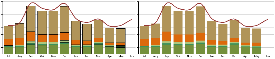
As a Cognos BI example, let’s look at a couple of charts.
If you like the right one (it’s ”scientifically” better from data/junk ratio), there’s a setting to turn off those black box borders in bar charts in Report Studio right here.
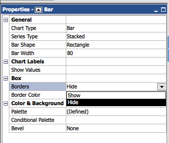
But by default it’s on and just tell me, how many times did you switch it off?